반응형
Notice
Recent Posts
Recent Comments
Link
NOW OR NEVER
[Android] Material 3 Design 본문
반응형
Material 3 Design
Material Design
Build beautiful, usable products faster. Material Design is an adaptable system—backed by open-source code—that helps teams build high quality digital experiences.
m3.material.io
- 현재 기준으로 jetpack 사용하는 경우 material3가 적용이 안될 수 있어 material2 권장
- 현재 기준 공식 버전 : 1.9.0
- 뭐하고 같이 쓸 때는 무조건 material tool bar로 배치
적용 방법
- build.gradle(app) 에서 com.google.android.material.material : 1.9.0이상 버전으로 업데이트
implementation 'com.google.android.material:material:1.9.0'색상 설정
- dynamic color : 다이얼로그, 바텀시트, 툴바, 앱바 등 배경 위에 뭔가 올라갈 때 뜰 때 해당 색이 주변에 물들어지는 듯하게 표현되며 주변 색과 어울리게 해주는 것
- res/values/themes.xml 파일에서 작업한다.
- colorPrimary : 애플리케이션을 대표하는 색상, 애플리케이션의 모든 요소들의 색상이 해당 색상에 영향을 받는다.
- 설정 시 왼쪽에 나온 색상 더블 클릭 후 오른 쪽에 나오는 드롭다운에서 android, library 등 클릭하면 해당 선택한 항목이 지원하는 색상들을 볼 수 있다. 나온 색상들 중 하나 클릭 시 그 색상으로 설정 할 수도 있다.
- colorOn이 붙어져 있는 것들은 표시되는 글자, 아이콘 등의 색상
- colorOnPrimary : 어플리케이션을 대표하는 색상인데 글자나 아이콘 등의 색상
- colorPrimary 적용 끝난 후 다른 것들을 색상 설정해서 덮는 방식으로 설정하는 것이 좋다.
- colorPrimaryDark : 대표 색상 중에 조금 더 어두운 색상으로 설정되어야 하는 부분 설정(대표적으로 상태 바에 관련된 설정을 따로 하지 않으면 해당 색상을 적용) colorPrimary 보다 좀 더 어두운 색상으로 설정해야 함
- colorAccent : 강조 색상, colorPrimary와 대비되는 색상으로 설정
- colorControlNormal : controller(editText, checkBox,radio button, progress bar 등)에 사용하는 색상
- colorControlHighlight : 위젯을 터치하거나 액션이 일어났을 때 나타나는 색상
- navigationBarColor : 네비게이션 색상을 설정(android API 21부터 적용)
Elevation
- 공중에 살짝 떠 있는 듯한 효과를 주는 요소
- ui 요소에 그림자를 줘서 공중에 떠 있는 듯한 효과를 줄 수 있다.
- 설정을 했는 데도 그림자가 나타나지 않을 경우
- translationZ에 elevation 속성 값과 동일하게 설정
- 1번을 이행해도 안된다면 배경색이 투명 색인 경우이므로 배경색을 설정해준다.
Component
- components : 눈에 보이는 요소들
- https://m3.material.io/components 여기에 없는 것들은 기존에 있는 것들 사용,
- material component 예제 : https://github.com/material-components
Button
- @style/Widget.Material3.Button.-
- Icon Button
- @style/Widget.Material3.Button.-.icon 을 쓰거나 @style/Widget.Material3.Button.IconButton 쓰면 됨
- Elevated button : 그림자가 들어가 살짝 떠 있는 듯한 버튼
- style : @style/Widget.Material3.Button.ElevatedButton
- Filled Button : 기본 버튼

- Tonal Button

- Text Button

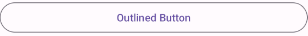
- Outlined Button
Material Button Toggle Group
- 항목이 많지 않으면 체크박스나 라디오 박스 대신 쓸 수 있다.
- layout 디자인 설정 : containers - <view> 끌어다 배치 - materialButtonToggleGroup 만든 후 코드 뷰로 봐서 view 태그 아래 코드 처럼 수정
<com.google.android.material.button.MaterialButtonToggleGroup
    android:layout_width="match_parent"
android:layout_height="wrap_content" />- 메서드
- checkedButtonIds : 다중 선택 시 Toggle Group 내 선택된 버튼들 아이디 가져옴
- checkedButtonId : single selection 이용 시 선택된 버튼 아이디 한개만 가져움
- check(R.id.버튼아이디) : 체크 상태 설정
- uncheck(R.id.버튼아이디): 체크 해제 설정
Floating action Button(FAB)
- 떠 있는 듯한 버튼

- button 이랑 똑같이 동작
- Extende FAB : 버튼이 커졌다 작아졌다 가능
- layout 파일에서 fab 버튼 배치 후 코드 뷰로 들어가서 태그 이름 수정해주기
<com.google.android.material.floatingactionbutton.ExtendedFloatingActionButton
- 메서드
- isShown : fab 버튼이 보이는 상태면 true 아니면 false 반환
- hide() : fab 버튼 숨기기
- show() : fab 버튼 보이게 하기
- shrink() : fab버튼 접기
- extend() : fab 버튼 확장
Progress Indicator
- 프로세스 로딩 중 표현할 때 사용
- layout 디자인 파일에서 progress 태그 안에서 progress 디자인 설정
- 프로그래스 정도 모양 둥글게 만들기 : app:trackCornerRadius="10dp"
- 계속 로딩 되게 만들기 : android:indeterminate="true"
- Linear Progress Indicator
- layout 디자인 파일
- containers -view 배치 - LinearProgressIndicator
- 코드 뷰로 넘어가서 view 태그 아래 코드처럼 수정
- layout 디자인 파일
<com.google.android.material.progressindicator.LinearProgressIndicator
    android:layout_width="match_parent"
    android:layout_height="wrap_content" />
- Circular Progress Indicator
- layout 디자인 파일
- containers -view 배치 - CircularProgressIndicator
- 코드 뷰로 넘어가서 view 태그 아래 코드처럼 수정
- layout 디자인 파일
<com.google.android.material.progressindicator.CircularProgressIndicator
    android:layout_width="wrap_content"
    android:layout_height="wrap_content"/>
- 메서드
- progress : 현재 progress 값 가져옴
- setProgressCompat(progress값, animation 줄 것인지[true/false]) : progress 값 설정
Bottom Sheet
- 아래에서 위로 올리면 나오는 요소
- 코드를 통해서 아래에서 위로 올라올 때는 처음에 아예 안보이게 설정
- 사용자 조작을 통해서 아래에서 위로 올라올 때는 조금만 보이게 설정
만드는 방식
- fragment를 만들어서 그 fragment를 bottom sheet로 만들기
- 레이아웃 파일을 하나 만들어서 엑티비티 레이아웃 안에서 만들었던 레이아웃을 또 배치해서 만드는 방법
- bottom sheet layout 설정
- 드래그로 bottom sheet 보이게 할 경우 : containers - view 배치 - BottomSheetDragHandleView
- 전체 layout에 아이디 지정
- 전체 layout의 style을 @style/Widget.Material3.BottomSheet으로 설정
- bottom sheet layout 만들 때 layout behavior은 @string/bottom_sheet_behavior
- activity layout 설정
- 전체 layout 형태 coordinator layout로 convert
- containers - linearLayout 배치 : 여기에 main acitivity 실행 시 보여 줄 요소 배치
- containers - include 배치(bottom sheet layout 파일)
- inclue 세팅
- The view is not associated with BottomSheetBehavior 에러 : iclude에 style과 behavior 셋팅(아래 코드) 안해줘서 생긴 에러
- style="@style/Widget.Material3.BottomSheet"
app:layout_behavior="@string/bottom_sheet_behavior"
- style="@style/Widget.Material3.BottomSheet"
- app:behavior_peekHeight="50dp" : 접힌 상태 일 때 얼만큼 보이게 할 것인지 세팅
- The view is not associated with BottomSheetBehavior 에러 : iclude에 style과 behavior 셋팅(아래 코드) 안해줘서 생긴 에러
- activity.kt 코드
- bottom sheet 행동 관리하는 객체 생성 : val sheetBehavior = BottomSheetBehavior.from(include아이디.bottomSheetLayout아이디)
- bottom sheet 객체 메서드
- .isHideable : true 면 bottom sheet 안보이는 상태 / false 면 보이는 상태
- .state : bottom sheet 상태
- 펼친 상태 : BottomSheetBehavior객체.STATE_EXPANDED
- 완전히 안보이는 상태 : BottomSheetBehavior객체.STATE_HIDDEN
- Dragbar까지만 보이는 상태 : BottomSheetBehavior객체.STATE_COLLAPSED
- bottom sheet layout 설정
Carousel
- recycler view의 한 종류
MaskableFrameLayout
- activity layout 설정
- row layout 설정
- com.google.android.material.carousel.MaskableFrameLayout 태그가 최상위여야 한다.
<?xml version="1.0" encoding="utf-8"?>
<com.google.android.material.carousel.MaskableFrameLayout
    xmlns:android="http://schemas.android.com/apk/res/android"
    xmlns:app="http://schemas.android.com/apk/res-auto"
    android:id="@+id/carousel_item_container"
    android:layout_width="150dp"
    android:layout_height="wrap_content"
    android:foreground="?attr/selectableItemBackground"
    app:shapeAppearance="?attr/shapeAppearanceCornerExtraLarge">

    <ImageView
        android:id="@+id/carousel_image_view"
        android:layout_width="wrap_content"
        android:layout_height="wrap_content"
        android:scaleType="centerCrop"
        app:srcCompat="@mipmap/ic_launcher" />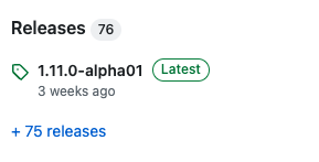
</com.google.android.material.carousel.MaskableFrameLayout>- CarouseLayoutManager에서 HeroCarouselStrategy(), FullScreenCarouselStrategy() 등 이용하고자 material 1.11.0-alpha01 적용할 경우 설정
- build.gradle(app)
- complie sdk를 34로 설정
- material 버전 1.11.0-alpha01로 변경
- build.gradle(app)
Dialog
- 기존 만들던 방식이랑 동일함
- 클래스 이름만 다름 AlertDialog -> MaterialAlertDialog
val builder = MaterialAlertDialogBuilder(this@MainActivity).apply {
    setTitle("Material Alert Dialog")
    setMessage("Material Alert Dialog 입니다")
    setNeutralButton("Neutral"){ dialogInterface: DialogInterface, i: Int ->
        textView.text = "Material Alert Dialog - Neutral"
    }
    setPositiveButton("Positive"){ dialogInterface: DialogInterface, i: Int ->
        textView.text = "Material Alert Dialog - positive"
    }
    setNegativeButton("Negative"){ dialogInterface: DialogInterface, i: Int ->
        textView.text = "Material Alert Dialog - Negative"
    }
}
builder.show()
Navigation rail
- Tablet 앱에서 많이 쓰이는 요소이다. 모바일의 경우 이것 보단 Side sheet(오른쪽에서 왼쪽으로 나옴), Bottom sheet, Navigation drawer(접었다 폈다 가능) 많이 씀
- 아이콘만 표시하고자 할 때 많이 쓰임
- 생성 방법
- menu layout
- menu 생성
- menu item 배치
- icon 설정
- showAsAction 속성을 ifRoom으로 설정
- activity layout
- containers - view 배치 - NavigationRailView
- NavigationRailView menu 속성에 menu layout 등록
- menu layout
- 메서드
- selectedItemId : 선택된 메뉴 아이템 설정, 리스너 설정 후 설정하는 것이 좋다.(리스너 뒤에 위치)
- labelVisibilityMode : 라벨 보이는 모드 설정
- NavigationRailView.LABEL_VISIBILITY_UNLABELED
- NavigationRailView.LABEL_VISIBILITY_LABELED
- NavigationRailView.LABEL_VISIBILITY_SELECTED : 선택했을 때만 보이게
- NavigationRailView.LABEL_VISIBILITY_AUTO : 자동으로 설정
- 리스너
- setOnItemSelectedListener : 메뉴 아이템 각각 클릭할 때마다 나오는 이벤트 설정
setOnItemSelectedListener {

    when(it.itemId){
        R.id.menu_item1 -> {
            textView.text = "첫 번째 항목을 눌렀습니다"
        }
        R.id.menu_item2 -> {
            textView.text = "두 번째 항목을 눌렀습니다"
        }
        R.id.menu_item3 -> {
            textView.text = "세 번째 항목을 눌렀습니다"
        }
    }

    true
}
ETC
- 폴더 위치 바꾸면 최초에는 해당 프로젝트 폴더 경로까지 작성해줘야 한다.
- hybrid
- ui나 hybrid 컨텐츠 만들 때 flutter, native 사용
- hybrid 앱은 모바일 웹 기반
- native는 한번만 만들어서 안드로이드, 아이폰 다 사용 가능, flutter은 각각 하나씩 만들어 주면 됨
'Android' 카테고리의 다른 글
| [Android] ViewPager2 Fragment 안보이는 Error (0) | 2023.07.27 |
|---|---|
| [Android] SQLite 외부 DB파일 이용해서 안드로이드 내 DB로 사용하기 (0) | 2023.07.26 |
| [Android] Google Maps 2 - 주변 지역 검색 (0) | 2023.07.20 |
| [Android] Google Map API & Splash (0) | 2023.07.19 |
| [Android] 사진 저장 & Network (0) | 2023.07.18 |
'Android' Related Articles
more


Comments